Money has been a recurring theme in this recent holiday. Most obviously we were travelling in Greece, which is undergoing a financial crisis. This required me carrying far more cash than I would usually do since for a while the cash machines were offering a limited service at best. My own finances were also somewhat turgid, our trip being necessitated by my girlfriend’s son’s visa being about to expire. We had to spend a week out of the country even though recent other expenses had made this a bad time for me to be spending. If you have been considering buying any of my books or using the donation button, now would be a good time, thank you.
One store in town had a counter top covered with a variety of foreign bank notes under glass. Quite an impressive collection. I took my girlfriend and her son there to see a British one pound note (long since discontinued). There was also an American $2 note and another note with a grinning Saddam Hussein.

Something that came to my attention on this trip was the similarity between certain Euro notes. Both the fives and twenties appear a blue colour, the tens and fifties a red. They look distinctive in the above picture but in practice it was quite easy to confuse these if you were not careful. Given that the Euro is a relatively new banknote design it is a little surprising that more thought did not go into its design.
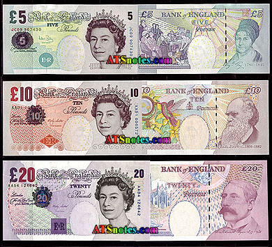
British banknotes, for example, are different colours. £5, £10, £20 and £50s are respectively blue, brown, purple and red. £1 notes were green and the £1 notes still issued by some regional banks are still this colour. Some series of notes also featured a distinctive simple shape in this colour. For example, the £5 a blue circle, £10 had a brown/orange diamond, the £20 a purple square and the £50 a red triangle. (The current £20 seems to have dropped this feature) These shapes were designed to further aide the partially sighted. Different denominations were also different sizes. I have been told that the visually handicapped were provided with a little gauge they could use to measure the length of a note to identify it.

The now discontinued Dutch Guilder notes took this a step further by providing raised tactile markings to assist the visually impaired (the dots and triangles). One might have hoped the designers of the Euro would have drawn on these sources for inspiration, but apparently not.
Some Canadian notes have tactile markings for the visually handicapped and it is apparently planned for some US banknotes. It would, however, be more useful if this became a universal feature. Next year the Bank of England plans to issue polymer banknotes. This would be a good opportunity to introduce tactile markings but I expect this will not be exploited.
If you have enjoyed this article or it has been helpful to you please feel free to show your appreciation. Thank you.The Books